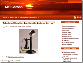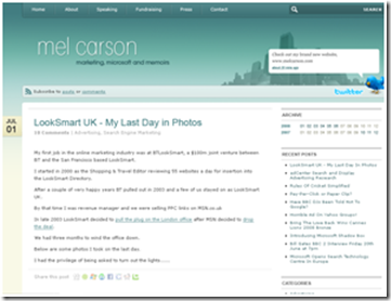
After 10 months and 226 posts I decided I needed to move away from the rather RED theme I’d been using and get a bit more funky with its design.
So with the help of Dave and the guys from Bronco plus some priceless advice from the fabulous Shari, we came up with what you see today! Thanks to them and everyone else I’ve bothered by asking for their opinion.
The first stab was a bit greener than I’d have liked so we evolved it to be bluer with green elements, like the heading for instance.

The pictures are supposed to show a British/London flavour…..

….and the Twitter widget is simply fabulous – http://twitter.com/melcarson
It’s been an fascinating experience as there are so many elements and thought processes that go into designing a blog. From SEO to accessibility and design, colouring and mood creation etc….
I’ll now be pouring over Jen’s blog advice and ticking off her check list!
Would love to get your feedback – so let me know what you think….
Subscribe to the RSS feed or to email updates!
If this site has piqued your interest in hiring Mel, either as a speaker for your event or as a consultant for your business, contact him now to start a conversation about how he can help...
Get in touch with Mel
Looks fantastic Mel! Really easy on the eyes and I like the twitter bird-
A nice improvement. But didn’t you leave a few people off your blogroll? 😉 Will I see you at SES San Jose?
Bryan
Thanks Bryan – I’m going to have to re-think the BlogRoll and maybe do a links page. And I’m working on San Jose 🙂
Great work, little to blue for me. Wonder where that comes from? Con grats!
Looks great Mel, here are some blog SEO tips for you: http://tinyurl.com/blogseo
Outstanding Mel. Love everything about it.
Cool blue, very cool!
Looks great! However, do you think your French colleagues would think the photo of Nelson’s Column indicative of a quintessential ‘British/London flavour’ or a cultural faux pas?! N’est ce pas?
My French friends are very aware that my birthday is Trafalgar Day – I remind the every time I visit the Paris office 🙂
Hi Mate
Like the look of the new blog, great improvement on the old one!
Great work, little to blue for me. Wonder where that comes from? Con grats!