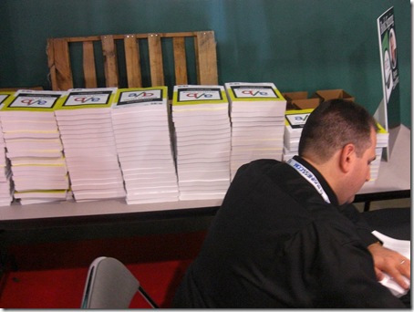
Bryan Eisenberg – “How many more books do I have to sign?”
Bryan’s Publisher – “Erm…….at least this many Bryan!”
A light lunch! Not in a box this year – more of a compartmentalized tub!
Mike Grehan’s crash course in Brit-speak ‘n’ spell!
Virginia and Jeremiah partying for charity!
Kevin and Matt leaving early to get ready for Satya’s keynote in the morning 🙂
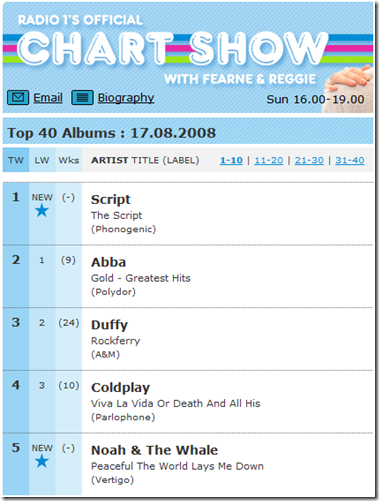
Not often I’m right about music but I did tip this the Irish band – The Script – back in April!
Their debut album just went straight in at Number 1. I have it and it’s fabulous!
My mate Dixon Jones won’t be at SES San Jose this year 🙁
Dixon and I go way back to about 2002 when I was working at Looksmart. It was Dixon who got of the phone with my boss Rob Pearson and let the world know on WebmasterWorld that we were about to close.
When I surfaced at Microsoft in 2005, the SES London panel where I made my speaking debut on behalf of adCenter was where Dixon gifted me some comments during his opening address which enabled my presentation to begin with the immortal line:
“Microsoft…….Sexy……..I bet you’ve never heard those words uttered together in the same sentence before!”
Since then we’ve become great friends and always have a picture taken of the two of us where ever we are in the world!
I’ve got so many I thought I’d publish one a week until they run out!
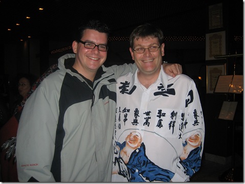
First up is us at Kristjan’s Icelandic Internet Marketing Conference in November 2006
It was very dark in Reykjavik that week, which must explain why Dixon got dressed in that shirt!

Well that’s what Dan Sabbagh, the Media Analyst for the Times Business Section said yesterday!
In his article, largely about digital TV advertising he claims “it should be remembered that Internet advertising is, like all fads, over- rated!”
In more than eight years I’ve never heard it called a fad and certainly not over-rated.
In fact, those that try it for the first time can’t believe they’ve been wasting so much cash on traditional forms of media.
Going on to criticise Google is just silly and negative.
According to the IAB, Internet Advertising was responsible for 15% of the £18.4 billion advertising spend in the UK last year – 38% up on 2006. Of that 57% was on search ads – well over £1 billion!
You can’t ignore growth like that Dan!
A bit difficult to grasp if not properly informed maybe, but it’s no fad and if anything, far too under-rated!
Search Engine Strategies is next week! Back in February I wrote SES London 2008 – 10 Reasons To Attend and won Best Photo Of A Marketing Trend for the photo below which was part of a raft I took entitled A Few Pictures.
So now I’m making it to SES San Jose to support my Microsoft colleagues who are speaking at the conference here are 10 more reasons why you should attend:
Jakob Nielsen’s AlertBox just gave me the heads up on the 10 Best Application User Interfaces of 2008.
Nice to see Eyeblaster’s Campaign Monitor leading the charge for the Online Advertising Industry!

The article describes why and what makes a good design interface and what I found interesting was Jakob calls out Microsoft Office’s “Menu Ribbon” as a factor in these great design examples.
“Many winners employ dashboards to give users a single overview of complex information and use lightboxes to ensure that users notice dialogs. Also, the Office 2007 ribbon showed surprisingly strong early adoption.”
Although a caveat is, “Microsoft user interfaces have not always been shining examples of good usability; the company has embraced usability in a big way only in recent years. About 10 years ago, the main design criterion was to pass a Bill Gates review, and Billg’s definitely not an average user.”
I think we’ve all come along way in the last 10 years!
Don’t you?
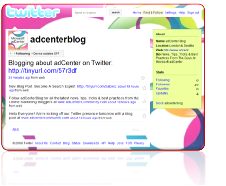
Just wrote a piece on the adCenter Blog about the adCenter Community Team updating Twitter followers about news, tips, tricks and online marketing best practices that we publish on the Advertiser Blog, API Blog and Web Analytics Blog
Follow adCenter at: http://twitter.com/adcenterblog
Follow me at: http://twitter.com/melcarson
If this site has piqued your interest in hiring Mel, either as a speaker for your event or as a consultant for your business, contact him now to start a conversation about how he can help...
Get in touch with Mel