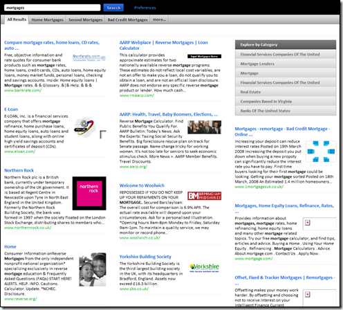
I’m in the middle of the adCenter Analytics Beta refresh fever at the moment so have only had a brief look at Cuil.com
I notice some folks have said they do or don’t like the layout of the results. It does give you a bit more info to go on plus some universal search-type images. But whether it’s to your taste or not it’s not that new as Tafiti.com was experimenting with a similar kind of layout when it when that launched last year.
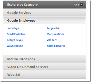
Categories are an interesting one as I thought they went out with the LookSmart directories many moons ago. Guess they supposed to be like Related Searches on Live Search?
A search for Google throws up some employees but alas no Matt Cutts 🙁

As Danny says it’s difficult to measure relevancy on just a few searches so I think they should be given some time to tweak before diving in properly.
Subscribe to the RSS feed or to email updates!
If this site has piqued your interest in hiring Mel, either as a speaker for your event or as a consultant for your business, contact him now to start a conversation about how he can help...
Get in touch with Mel
[…] reading Danny’s, and Mel’s first impressions of the new search engine launched by former Googlers, Cuil, I did what […]
[…] I said on Monday we needed some time to assess the relevancy, and was reserving judgement as I’ve been involved in launching big profile products and it’s not for the faint-hearted! […]